Logos
MOMS Appeal
September - November 2011 / MOMS Appeal
James designed the logo for the MOMS (Multidisciplinary Obstetrics and Midwifery Safety) Appeal a British charity doing research, training and international development at home and abroad, which is based at Chelsea and Westminster Hospital in London. They wanted a fun and colourful logo to represent a promising, optimistic outcome and future that they are working towards with mothers and babies at the forefront.
James designed the new logo for the MOMS Appeal in time to represent the charity at the official launch at the Houses of Parliament in November 2011. James's logo is shown on their obstetric fistula video and will be used in the future when the website is redeveloped. Unfortunately it has not yet been incorporated onto their existing website because their web designer is no longer able to do the work for the charity.
Norfolk Fencing Ltd.
July 2006 / Norfolk Fencing Ltd.
James designed the logo and branding for Norfolk Fencing Ltd. (who changed their name from Savory Fencing Ltd.) wishing to keep enough recognizable similarity and continuity for its customers whilst portraying its link and heritage from down under as New Zealand fencing, fencers and techniques are highly regarded throughout the world. North Norfolk is well known for its bird life which often sit on fencing, mirroring its southern hemisphere origins, the fence acting like the equator, mirror or the reflective qualities of water on a wading bird. There is also a symbolic likeness to yin yang, the journey taken or about to be taken and an auger (end on) which when rotating is used to drill holes in the ground.
Savory Fencing Ltd.
June 2004 / Savory Fencing Ltd.
James designed the logo and branding for Savory Fencing Ltd. who's origins were from New Zealand hence the stylized Kiwi. New Zealand fencing, fencers and their techniques are highly regarded throughout the world.
Dolphin Logo
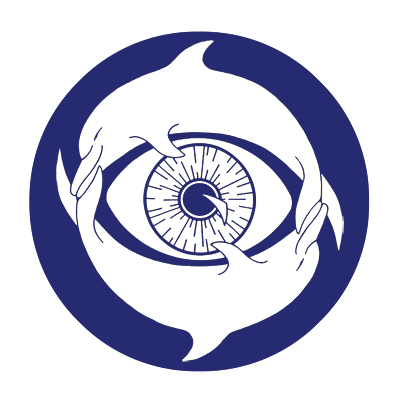
July - December 1997 Although based on a much earlier design.
James designed this logo for himself to be used on his website and business card. The sea is and has been a big influence and part of his life having been brought up on a small Greek island. This design shows his love for the sea and dolphins in particular, one of the sea's most charismatic and intelligent creatures, their fun and playful natures, their constant movement and journey, mirrored by that of the sea and the symbolic circle of creation and the balance and harmony of Yin and Yang.
The logo also represents a charm to ward off the 'evil eye' found in many cultures but originating from ancient Greece, the staring eye is supposed to bend the malicious gaze back to the sorcerer or averting bad luck.